Step 1: Find a Font
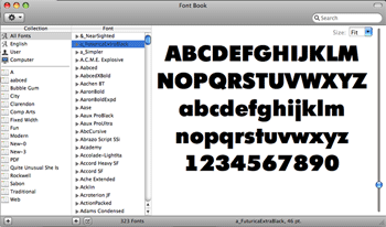
When doing an illustrative typographic artwork, consider using a thicker font (see this collection of free bold sans serif fonts) because they give us more surface area to work with. The font I have used here is Futura Extra Black.
Step 2: Make a New Document in Illustrator
Now open Adobe Illustrator, make a new document (Cmd/Ctrl + N), and then use the suggested settings shown below.

Step 3: Make a Layout Grid
For this piece, I started by making a grid just to get some proportion and structure going.
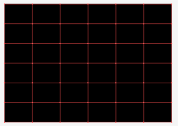
First, make a rectangle that fills the A4 landscape artboard. Use whatever stroke and fill you want.

To cut this up into a grid, use the Split Into Grid command, found via Object > Path.
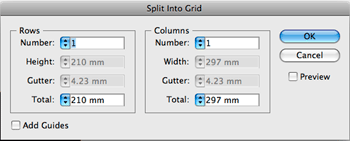
I used a setting of 6×6”, with no gutter. Once you’ve split your rectangle into a grid, hit Cmd/Ctrl + 5 to convert it into guides. You can also use the Make Guides command via View > Guides > Make Guides.
It is always good to start off with a layout grid especially with typographic work because it gives you some structure as well as some rules (that you can always break later, if needed).
Step 4: Make the Words
Type the words you want in your desired thick font using the Type Tool (T). I typed the words "DESIGN INSTRUCT".
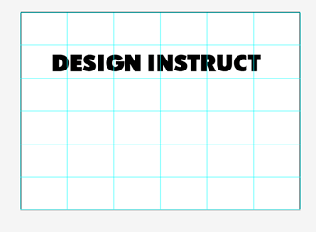
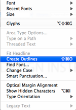
Select your type with the Selection Tool (V) and make them into outlines by going to Type > Create Outlines (Shift + Cmd/Ctrl + O).
Tip: It might be good idea to hold down Option/Alt and then drag your type into the Pasteboard to make a copy of it in case you want to change any words later.
Select the outlined type and then ungroup them by pressing Shift + Cmd/Ctrl + G. Each character can now be selected on its own to adjust its kerning, tracking, leading, and other characteristics.
We could have adjusted the tracking and the leading while the words were still an editable text object using the Character Panel, but I prefer doing it this way because I feel like I have more control over the space and placement of each character. Moreover, it’s always good to have alternate ways of doing things; it keeps you excited about your work.
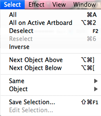
Note and memorize the shortcuts for the Next Object Above (Option/Alt + Cmd/Ctrl + ]) command and the Next Object Below (Option/Alt + Cmd/Ctrl + [) command. Use these shortcuts in conjunction with the Left, Right, Up, and Down Arrow keys to move your type. It’s much easier than having to move your hand to the mouse every time you want to select the next character.
Step 5: Create a New Window without Edges and Guides
Before proceeding with your letter-spacing and leading adjustments, first make a new window (Window > New Window).
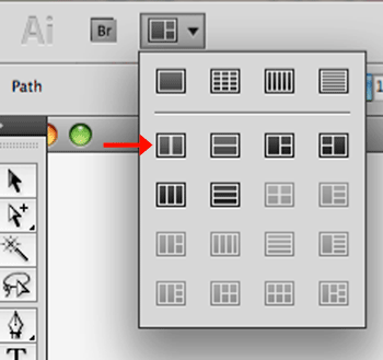
In the new window, locate the Arrange Documents dropdown menu found on the Application Bar, and then choose the 2-Up option that should display your work side-by-side vertically.
In one of the windows (depending on preference — it can be the left or right), toggle Hide Edges (Cmd/Ctrl + H) and Hide Guides (Cmd/Ctrl + ;).
Doing this will allow you to have a window that will always be at a nice viewable scale that is free of distractions from guides and selection edges.
Step 6: Cutting Up the Words
Below is the type in place with reference to the grid and with tracking and leading adjusted. The word "DESIGN" has also been ungrouped so that each letter can be colored with different strokes and fills.

On the black-filled type, create a pattern on top of it using the Pen Tool (P) with a stroke of white and a fill of None.

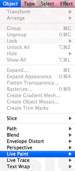
Select both the "DESIGN" type and the white strokes then apply live paint (Object > Live Paint) to the selection.
While everything is still selected, apply the Divide effect (Effect > Pathfinder > Divide). It is important to note that you should use the effect instead of the command; the Divide command under the Pathfinder Panel will not work for what we want to accomplish.
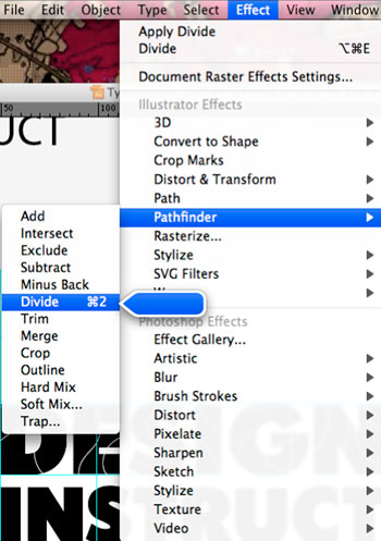
While still selected, Expand the selected object’s appearance (Object > Expand Appearance) which should result in the type being cut up in different sections.
Now hit the D key to apply the default black stroke and white fill onto your cut-up text. I like doing this before I color in my pieces because it gives me a good starting point.

Step 7: Coloring Technique — Color Samples + Eyedropper Tool
Have you ever been stuck for color inspiration? If so, then look no further than the various swatch libraries available in Illustrator. For this piece, I’ve picked the Kids Stuff color scheme (Window > Swatch Libraries > Kids Stuff).
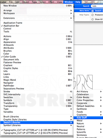
Although the Swatches Panel in Illustrator is very handy, I prefer making my own set of swatches to sample from on my actual working artboard (or the space outside the artboard — the pasteboard).
First, make a perfect square with the Rectangle Tool by clicking on the tool from the Tools Panel and then holding down Shift and dragging a square on your artboard.
Then Alt/Option + drag this square to make a copy. Once that’s done, hit Cmd/Ctrl + D to duplicate the squares.
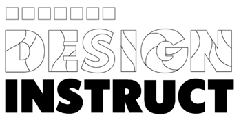
Now that you have these squares, pick your desired swatch color and merely drag and drop on the square object to fill it.
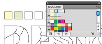
Select all the squares and change their stroke to None.

Now that you have these swatches near your art, it’s time to use the Eyedropper Tool (I) as an unlikely replacement to the Paint Bucket Tool. With the Eyedropper Tool, sample a color from the swatches you have made and then Option/Alt + click whatever object on your composition you want to be colored.

Step 8: Time for Some Detailing Work
The drip detail shape below is made up of a circle with a rectangle on top of it. They were combined using the Shape Builder Tool (Shift + M). To use this tool, you first have to select the two shapes that you want combined. Then use the tool by dragging across both shapes in the area you want them to be combined.
To make the drip’s shadow, select the shape you’ve just combined and hit Shift + D to toggle into Draw Behind Mode.
With the Draw Behind Mode activated, Option/Alt + drag the shape to make a copy behind it.
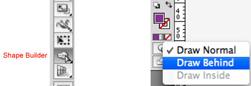
Once the shape is complete, drag and drop it into the Brushes Panel to make it into an art brush, making sure to choose the Scale Proportionally option in the dialog window that appears.
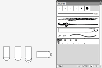
With the Brush Tool (B), select the brush you’ve just made and then create a new layer for this particular detail as it is good practice to separate your details onto another layer to keep your work organized and have them easily isolated and selectable later on.
On the new layer, brush onto the art whilst holding down the Shift key — this makes sure you draw the brush in a straight line.
When you are happy with your detailing brushwork, select all the contents of the layer by pressing Cmd/Ctrl + A (Select > All) and expand the brush strokes’ appearances via Object > Expand Appearance. Notice how doing this makes the brushes into editable paths.
Now you can color them using the technique discussed above using your color samples and the Eyedropper Tool.
For the example below, I use the same fill color as the base color, and for the shadow, a color that is a darker variant of the base color. It doesn’t necessarily have to be a darker version of the fill color. Note the red drip with a purple shadow. I used the purple because it’s a neighboring color. I find applying color with consideration to an element’s surroundings gives the piece a greater sense of depth and realism.

Step 9: Some Contrasting Shapes for Attraction
It is good to have elements that have contrast to the type work. It provides interest and personality. In the example below, I have selected "INSTRUCT" and applied a round corner effect to it (Effect > Stylize > Round Corners). I want to warn you now that this effect is not perfect; it merely just gets you started.
Once you’ve applied the Round Corners effect and while the selection is still active, go to Object > Expand Appearance.
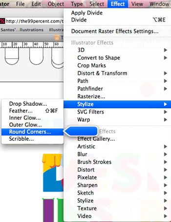
Next, it’s time to "finesse" the anchor points. Use the Direct Selection Tool (A), the Convert Anchor Points Tools, and whatever tools you prefer to clean up the anchor points and refine the paths produced by the Round Corners effect.

Step 10: Adding More Details
Because of the organic nature of this project, I tend to jump around and do different things. So here, I show you that I again start to make more details. Why? No good reason other than because I feel like it. This is when the project starts to become more intuitive and natural.
When making these details and elements, there is an element of play and experimentation, and you just have to remember to have fun and explore different techniques to come up with intriguing stuff and new methods.
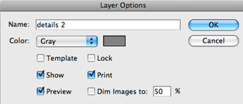
I start by creating a new layer for my new detailing work. It just makes it easier to select later on.
I create a couple of objects with the Ellipse Tool and Pathfinder Panel and color it using the Eyedropper Tool technique.
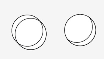

But then I have an impulsive desire to go back to the "INSTRUCT" type and add more details to it. So I will revisit this layer later on and finish up my details.
Step 11: An Alternative Way of Doing Detail Work
Before adding details via the Live Paint + Divide technique to "INSTRUCT", make a new layer and then copy the "INSTRUCT" fill onto it so that you have a copy for later. This is just a precaution I sometimes take when I am about to make drastic changes to something that took a while to make.
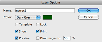
On the original "INSTRUCT" layer, double-click on the "N" to enter Isolation Mode.
In Isolation Mode, select the "N" and lock it (Object > Lock > Selection).
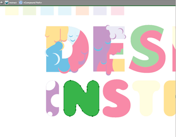
With the "N" locked, make wavy lines using the Pen Tool (P) with a stroke of black and a fill of None. Duplicate the wavy lines as desired by holding down Option/Alt and dragging.
Once you are done with the wavy lines, Unlock the "N" object via Object > Unlock All.
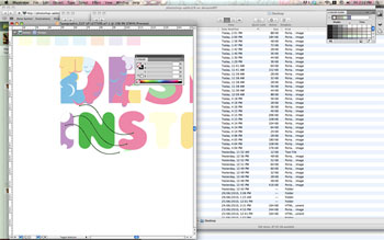
Now apply the Live Paint + Divide effect technique we discussed earlier in this tutorial to cut this shape up with the wavy lines.
Step 12: Adding More Spontaneous Detail Work
Again, make a new layer for a new element to be incorporated in our piece.
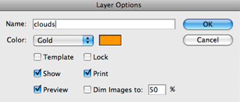
This design element was made simply with a white circle on top of a blue-filled circle. Once the circles were drawn using the Ellipse Tool (L), they were then grouped (Cmd/Ctrl + G).
With the Selection Tool (V) and Draw Behind mode toggled on, they were duplicated behind just by holding down Option/Alt and clicking-and-dragging.

To create variations and tweak the placement of the individual cloud puffs, I used the Group Selection Tool (found by clicking-and-holding down on the Direct Selection Tool in the Tools Panel). Clicking once on the area of the artboard that has a group allows you to select individual objects within a group, and double-clicking enables you to select a group within a group; a very handy tool!

At this point, I’m starting to play around with the idea of clouds having a black fill. But I really can’t be bothered selecting every single white-filled object; it will just take too much time. This is when our Magic Wand Tool (Y) becomes handy. Pick the tool in the Tools Panel and then isolate the clouds layer to make sure only the clouds layer is selectable.
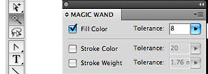
Then in the Magic Wand Panel, toggle the fill selection setting until you can only select the white fills. Once selected, change the fill color as you wish.

Step 13: Shaping the Composition
Make a new layer and name it "frame".
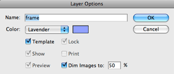
In the newly created "frame" layer, start by making a rectangle using the Rectangle Tool the same size and position as the artboard, and then cut it (Edit > Cut or press Cmd/Ctrl + X).
Make another rectangle that is significantly bigger than the artboard and then hit Cmd/Ctrl + F to paste the previous rectangle in front.
Select both items with the Selection Tool (V), and with the Shape Builder Tool (Shift +M), Option/Alt + click in the middle rectangle to reveal the contents of the artboard.
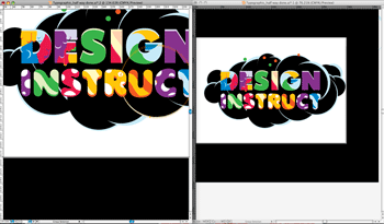
As you can see, the Shape Builder Tool is a powerful addition to Illustrator CS5 as it serves as an intuitive Pathfinder.
Step 14: Creating Highlights with the Stroke Width Tool and Art Brushes
We will use the new CS5 Stroke Width Tool to easily create highlights on our composition.
Start drawing the highlight by first making a line with the Line Tool (\). This line should have a stroke color that stands out on top of the cloud color, and it should have a fill of None. Also, in the Stroke Panel (Cmd/Ctrl + F10), make sure it has rounded ends.
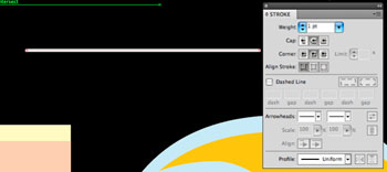
Choose the Stroke Width Tool in the Tools Panel. This tool really is a lot of fun, so just play with it. The handy thing to know about this tool is that if you want to adjust one edge of the stroke, hold down Option/Alt and drag with the tool.
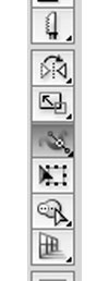
If you want to manipulate both sides of the stroke, drag with this tool and it will change both sides together.

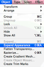
To make this shape a filled path, select it and expand its appearance.
Drag this new shape into the Brushes Panel to make it an art brush.

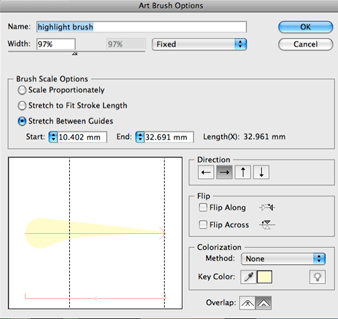
It is a good idea to play around with the settings in the Art Brush Options dialog box.
For this particular example, I have experimented with the Stretch Between Guides option. This is useful when you only want particular elements to stretch when you use this art brush but want to keep the element on one end intact. Later, I change this art brush’s setting back to Scale Proportionally; it really is all about trial and error.
Add a new layer for the highlights, as this design element can get very plentiful.
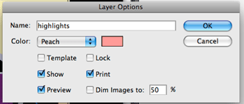
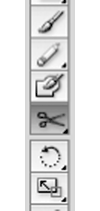
Now it’s time to brush on your new art brush with Brush Tool (B). When doing this, sometimes I find that I accidentally make it too long; that’s when I’ll use the Scissors Tool (C) to cut the path the Art Brush made. By the way, if you can’t see the Scissors Tool right away, click-and-hold down on the Eraser Tool in the Tools Panel.
Once you’ve cut the path, use your Selection and/or Group Selection Tool to select the undesired bit and then hit Backspace or Delete to get rid of it.

Step 15: More Elements — An Introduction to Draw Inside
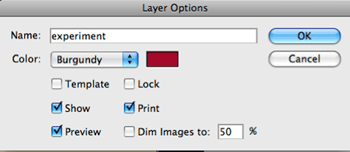
Sometimes I get bored easily, so I have to jump around and do different things to keep the creative juices flowing. I have created an "experimentation" layer to test ideas on.
Below is an element I’ve made using the Draw Inside Mode.
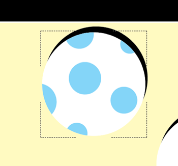
The design element above is a copy of the first element I created in this layer, but I have changed the colors. I selected the white fill shape with the Selection Tool (or if you have a grouped element, the Group Selection Tool).
Copy the object (Cmd/Ctrl + C) and paste it in front (Cmd/Ctrl + F).
Hit Shift + D until you see faint square surrounding the box. While the object is still selected, deselect the object (Shift + Cmd/Ctrl + D). Next, make other elements within this object and you will find that this mode automatically masks whatever you draw while you are on Draw Inside Mode.
To commit the shapes you have made into paths, select the path within the object, and then perform the Divide effect > Expand Appearance technique we talked about earlier.
Now I will show you the Paste Inside mode, but first, I’ll go through how to make a stripy element that will be pasted inside an object.
First, make an object like below and then double-click on it to enter Isolation Mode.
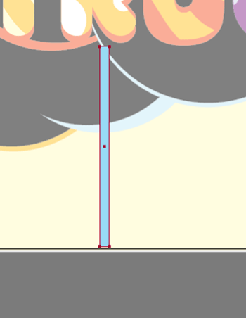
Option/Alt + drag this element to make a copy, then hit Cmd/Ctrl + D to make more copies.
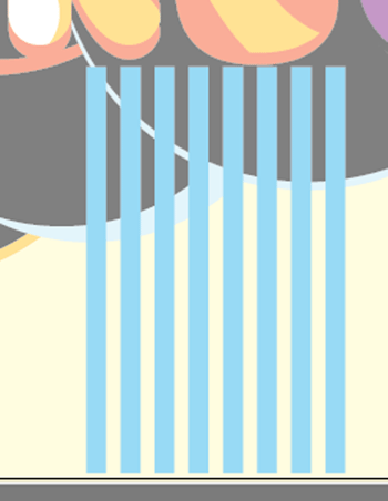
With the Direct Selection Tool, select the top anchor points of these rectangles.
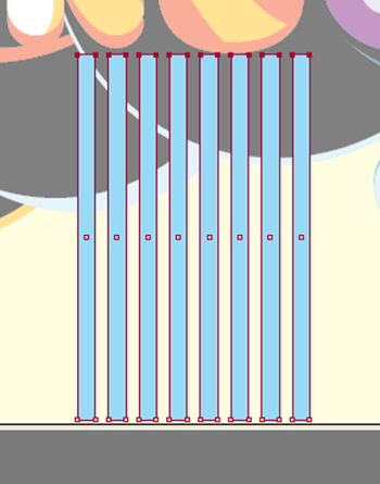
Also with the Direct Selection Tool, move these anchor points so that it creates a skewed shape.
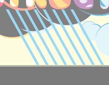
Below is a copy of the initial cloud element that I saved from a few steps ago. Select the whole object and apply the Divide command, this time via the Pathfinder Panel (Shift + Cmd/Ctrl + F9).
Then with the Magic Wand Tool, select things of the same color in this object and combine them with the Shape Builder Tool.

I want to paste the element inside the light blue fill, but before I do that, I need to make it into a compound path (Object > Compound Path > Make).
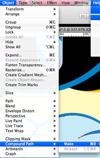
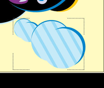
Select the compound path and hit Shift + D until it’s in Draw Inside Mode.
Cut (Cmd/Ctrl + X) or copy (Cmd/Ctrl + C) and then paste (Cmd/Ctrl + V) the skewed element in this compound shape.
Step 16: Going to Make Some Drastic Changes? Then Do a "Save As"
The nature of a digital workflow like this one is heavily reliant on endless experimentation, but sometimes we may feel hindered to experiment because it took a while to create things we have created thus far.
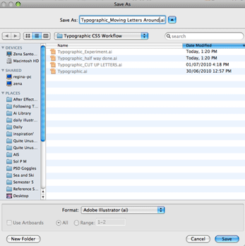
If you’re anxious about experimenting, do a "Save As" (File > Save As) and then work on the new file to try out different color schemes, compositions, layouts, and so forth.
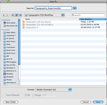
This is a good habit for when you are going to make drastic changes to your composition.
Step 17: Customizing Your Wacom Tablet
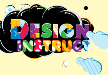
For the piece I am working on, I want to group each letter in the type work with its details I’ve made for them. This requires me to get the Group Selection Tool, select the base letters and details, cut them, paste them in place, and then while still selected, group them. I found that doing this for each letter in this piece to be a bit tedious.
So to automate this process and speed up my workflow, I go into my System Preferences > Wacom Tablet (for the Mac)/Start > All Programs > Tablet > Pen Tablet (for Windows).
Select the Add button for the Applications Tab and then add Adobe Illustrator.
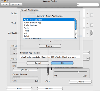
With Illustrator as the selected application in this window, customize one of your tablet pen buttons to do multiple shortcuts such that the button cuts (Cmd/Ctrl + X), pastes in place (Cmd/Ctrl + F), and groups the current selection (Cmd/Ctrl + G).

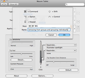
This is good for not only speeding up our workflow, but also ensuring we are doing things consistently.
Step 18: An Alternative Way to Experiment By Using Artboards
Before you do this step, go to File > Save As and save your work as another copy because it’s quite a drastic deconstruction.
Below is this piece with elements grouped together as desired.

Now it’s time to completely destroy the composition of this piece. You must be glad you did the Save As now, eh?
Pull apart the different elements. Here I’ve decided to put them in the Pasteboard and leave only the Background.
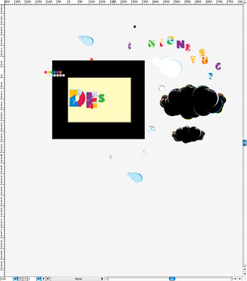
Start to put the elements back, playing with the element’s position, scale and other transformation properties, but feel free to play with other properties such as color, strokes, and so on.
To try alternative compositions and experimentation variants in the same file, you can use the Artboard Tool (Shift + O) with the Move/Copy Artwork with Artboard option enabled in the Options Bar. With the objects selected, Option/Alt + drag in the middle of an active artboard. You will now see the artboards and artwork duplicate together.
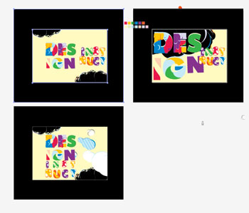
Below you can see I experimented with the composition of this piece three times until I found a basic composition I liked. I will further develop the bottom left artboard.
Step 19: Start Afresh with the Paste Remembers Layers Option
Select all the artwork you want to tweak and develop.

In the Layers Panel, enable the Paste Remembers Layers option.
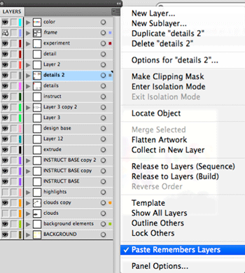
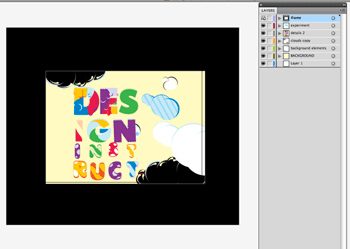
Make a new document with the same dimensions and settings as the current document. Then Paste (Cmd/Ctrl + V) the artwork in the new document. Notice how the layers are retained in this new document. Save this document.
Step 20: Use Guides When Tweaking Alignment and Spacing
In the new document, enable Rulers (View > Show Rulers or press Cmd/Ctrl + R to toggle its visibility).

Make a new layer for your guides.
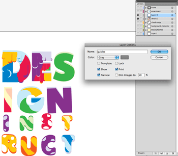
Start to drag out guides from the top and left rulers for alignment and space tweaking. In the below example, I use a reference point such as a character’s baseline. Now you can position and transform the other characters to make them align with guides. This process is made easier if you reposition the reference points onto a guide when using transformation tools such as scale, rotation, etc.
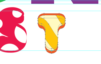
When tweaking space, you may find it beneficial to duplicate a set of guides to another position. For this example, I do it to make consistent leading space. You can make guides selectable and then duplicate them by holding down Option/Alt and dragging (if they are unlocked).
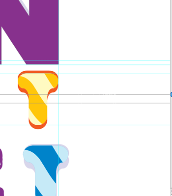
However, when aligning objects, you need to have your guides locked because you don’t want to accidentally move them. Therefore, it’s pragmatic to memorize the Lock Guides shortcut (Option/Alt + Cmd/Ctrl + ;).

Step 21: Creating the Illusion of Depth
Get or recreate the base shape of each character. Make two copies of the base character behind it (Send to Back while you are in Draw Behind Mode) and then offset each one (Object > Path > Offset Path) so they show up on the top and bottom of the character.
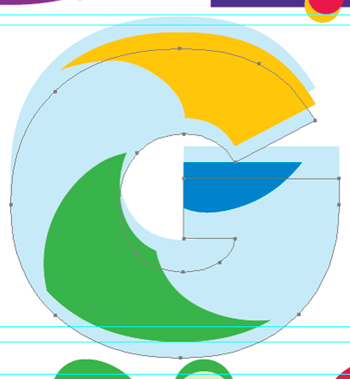
Color the bottom shape with a darker variant (and the top with a lighter variant) of the predominant color of the patterned character. In the example, the color is blue.
Do this process for each of the letters if you wish.
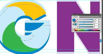
Round out the corners of these base shapes. You can use the Pencil Tool to edit the paths, the Direct Selection Tool (to edit the anchors), the Convert Anchor Point, or the Add/Remove Anchor Point tools; the choice is up to you.

Step 22: Overlapping Elements
Once you’ve spaced and aligned the characters as desired, start to reintroduce the elements back into the composition.
I use some of the elements to overlap over the character because it also emphasizes the illusion of depth and brings cohesion to the piece.

Step 23: Reflecting on Your Piece
Once in a while, I like to sit back, put down the graphics tablet, and reflect upon my piece to see what could be done to improve it.
In this part of the process, I thought that maybe the piece needed to be tied together by some element to make the composition more cohesive.

To make an element that guides the eye and gives cohesion to the piece, I first make a new layer just above the Background layer.
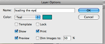
Then I create the element seen below. Notice how it is a tapering shape that starts from the D character — being thickest at the D character, and tapering down towards the bottom right corner.

Step 24: Trial and Error
Still with the desire to create cohesion in the piece, I now want to create white elements that tie the word "INSTRUCT" together.
I initially create a swirly path with the Pencil Tool, making this path’s stroke thick and with rounded ends.

Now use our newly discovered tool: the Stroke Width Tool. Experiment and make the path taper in different sections.

Create the base shapes of the "INSTRUCT" characters by copying and combining them, either with the Shape Builder Tool or Pathfinder Panel.

Expand the appearance of the white altered stroke you’ve made and then Shift + click the base character shapes.
With both elements selected, choose the Shape Builder Tool and then Option/Alt + drag/click with the tool to make the white stroke look like it is weaving in and out of the character.

I find that the tapered white stroke alone is not enough to tie "INSTRUCT" together. So again duplicate the character base shapes, send them behind the main character shapes and then apply an Offset Path effect (Effect > Path > Offset Path) to it.

After applying the effect, expand this selection’s appearance (Object > Expand Appearance).
As shown below, I’ve deleted the middle section of the white tie because it started to clash with the offsetted paths.

Step 25: Shading (Not Repetitive, But Intuitive)
To really make this piece pop, I give it some shading on a separate layer. The shading elements on this layer are made manually with the Pen Tool (P).
When shading, you will use three things: the Color Panel (F6), the Pen Tool (P) and the Eyedropper Tool (I). I suggest you remember the shortcuts for these tools as it will make the repetitive process of shading the artwork more organic and fun.
It is also a good idea to move the Color Panel in the middle of your work area so that it is easily within reach for this part of the process.

If you have a graphics tablet, you can customize your pen buttons to activate the Eyedropper Tool and Pen Tool. I like to customize these buttons when I am doing anything a little repetitive.

When doing this kind of shading work, you may find using your two views established earlier in this tutorial to be very handy.
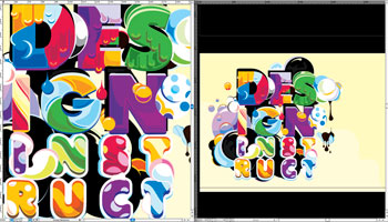
Step 26: Details Really Make a Piece
I find the highlights we made earlier are no longer working, so I delete and change them.
Don’t be afraid of taking out and changing stuff that just doesn’t work; you’ll find that, most of this time, doing this improves the piece.
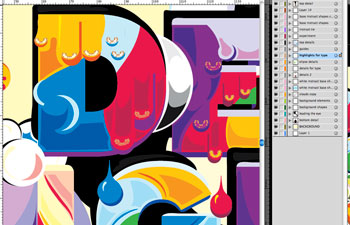
To give the piece a sense of context and space, I give it a very basic shadow and some texturing detail to suggest that it’s on a sandy ground.

Nearly there. Pause for a moment and reflect upon your piece one more time. Check to see if there are things that need tweaking, such as stray anchor points, offset paths, etc.
When you’re happy, your artwork is ready for exporting. You may want to use it as a desktop background, a print poster, whatever.

Step 27: Export Time!
Once you are completely happy with you piece, it’s time to export it as a JPG.
Go to File > Export.
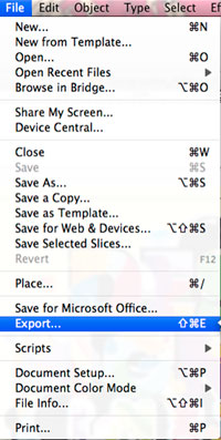
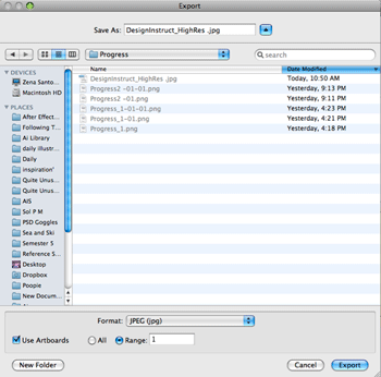
Specify a name, location to save in, and the file format. Make sure to check the Use Artboards option and then target the desired Artboard.
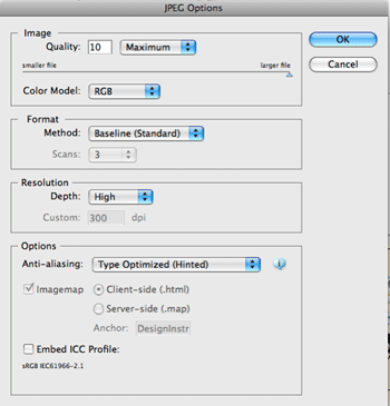
Use the following settings, and you are done!
Tutorial Summary
In the tutorial, I hope you have gotten some valuable insight into how a digital workflow can be quite intuitive, organic, experimental, and fun, especially with the help of a graphics tablet and the new features found in Illustrator CS5.
The main message I want to share with you is that playing, experimenting and pausing to reflect on your work from time to time are integral components of this type of digital workflow.
And finally, I hope this tutorial has shown you to not be afraid of trial and error and to change/delete elements if they just aren’t harmonious with the piece.



0 nhận xét :
Post a Comment
▄▀▄▀▄▀▄ -HAHEINEKEN.BLOGSPOT.COM ▄▀▄▀▄▀▄
- viết một nhận xét nếu thấy bài nào có ích
HƯỚNG DẪN DOWNLOAD TRÊN ADF.LY:
- Bấm nút download, Đợi 5 giây
- Rồi bấm vào hoặc
ở góc trên bên phải.